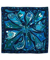
Matthew Williamson showed his first collection for the venerable house of Emilio Pucci a few days and...it looked like a Matthew Williamson collection. Any designer working for an iconic house like Pucci has a tough job to do - they have uphold the reputation and aesthetic of that house, but they can't just send out retreads of their predecessor's work either. However, Williamson took this collection so far away from Pucci's Italian luxury heritage that it was unrecognizable. Where are all the gorgeous psychedelic prints?
When I think of Pucci, I think of ultra-chic resorts on the Mediterranean, and vibrantly colored caftans, bikinis, and little dresses. Of course, a girl can't spend her whole life on Capri, but a whole collection using mostly solids and only one print? Emilio, we have a problem.
It's not that Matthew's debut collection was bad; it was actually quite good, it just wasn't Pucci. Case in point:


 Beautiful work, but one does not look to Pucci for a little black dress. Although I admire Williamson for trying to step out outside of the brilliantly patterned box, I think that he missed the mark . I did like the color palette (blacks and grays accented with vibrant blues and purples) and the print he did use (which was the cupola pattern from the archives), however, so hopefully his next collection will be better. Hey, we can't all go to the Italian Riviera for the winter, so we need a little Pucci to take us there, if only in spirit.




No comments:
Post a Comment